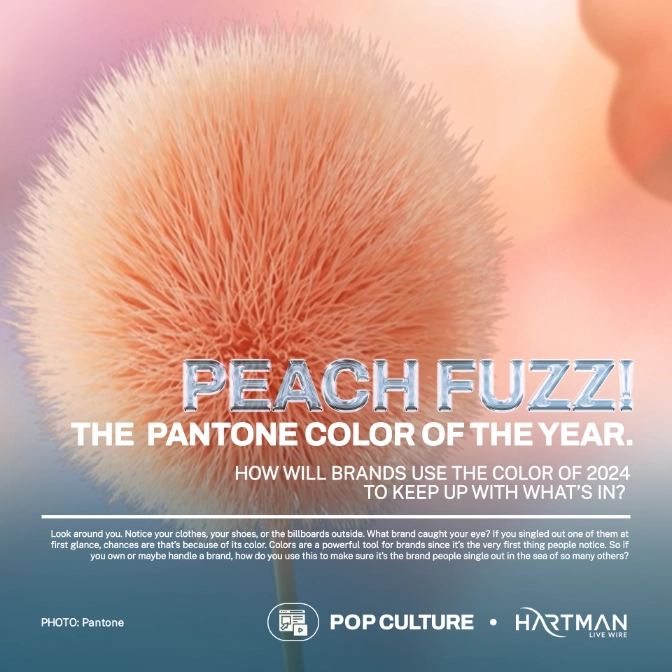
Look around you. Notice your clothes, your shoes, or the billboards outside. What brand caught your eye? If you singled out one of them at first glance, chances are that’s because of its color. Colors are a powerful tool for brands since it’s the very first thing people notice. So if you own or maybe handle a brand, how do you use this to make sure it’s the brand people single out in the sea of so many others?
Luckily, PANTONE assesses these colors and gives insight as to what will be the color of the year… for 2024 – Peach Fuzz or Pantone Color 13-1023. They describe it as “An appealing peach hue softly nestled between pink and orange, PANTONE 13-1023 Peach Fuzz inspires belonging, recalibration, and an opportunity for nurturing, conjuring up an air of calm, offering us a space to be, feel, and heal and to flourish from.”
This cozy comforting hue carries emotions of nurturing compassion and heartfelt kindness, perfect for such stressful times like today. Since colors are more than just visuals but go deeper into the emotions and psychology, using a relaxing color that makes people feel warm may just benefit your brand in ways you are yet to find out.
How to use it in a brand
Peach Fuzz, with its warmth and tactility, invites consumers to reach out and touch. Its shade is enticing for a variety of products, may it be food, beverages, clothing, and many more. Consider “warming up” your color schemes. Give your next poster, billboard, Instagram feed, or even your logo a dash of Peach Fuzz. Who knows your target market just might reach out to you because of it.

